Introduction
Thank you for purchasing Wizixo theme! We’re glad that you found what you were looking for. It is our goal that you are always happy with what you bought from us, and We hope that you will be able to create an outstanding website with our theme easily.
Before proceeding with the theme installation, It is recommended that you follow the steps listed below. We have covered all kinds of necessary information, and provide you with all the guidelines and details that you will need to use Wizixo theme. If you can’t find the answer you’re looking for, We encourage you to reach us through our Support portal. We'll be glad to help you out in your queries. Please Generate ticket through our Support portal.
Directory structure
Once you have downloaded the package, after theme extracting, you will see the following files & folder structure:
-
- documentation
- Includes theme's documentation files (on theme editing and setup).
-
- index.html
- Main documentation file. You are reading it at the moment.
-
- template
- Includes all assets and template files, used in theme
- assets
- Includes all assets files, like CSS, Images, JS, SCSS and plugins used in theme
- css
- Includes all .css files, used in theme
-
- images
- Includes all images, used in .html files.
-
- include
- Contains PHP files for contact form mailing functionality.
-
- js
- Includes plugin's initialization file
-
- scss
- Includes all of raw source files that are used to create the final CSS that is included in theme
-
- vendor
- Includes all plugins files.
-
- index.html
- You will find here all .html files used in theme
-
- gulpfile.js
- All the build commands
- package.json
- List of dependencies and npm information
- README.MD
Gulp
Gulp is a toolkit for automating painful or time-consuming tasks in your development workflow, so you can stop messing around and build something great in no time!
1. Install node
In order to use Gulp, you will need to download Node JS. If you don't have Node installed in your system, Please download the stable version of Node.js (LTS) NOT the latest.
Download Node JS2. Install Gulp.js Globally
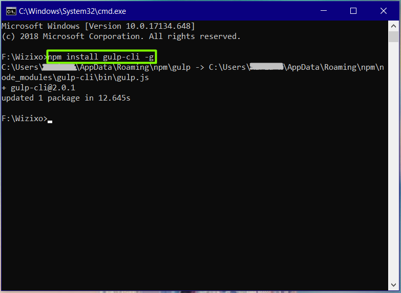
After installing Node on your system you can proceed to Gulp installation. Simply run the command below in your terminal which will install Gulp globally.
npm install gulp-cli -gNote: If you are using MacOS please use sudo keyword in the command because they need administrator rights to install Gulp globally. So full command will be sudo npm install gulp-cli -g
3. Install NPM modules
First, change the command line path into your project where Wizixo folder is located.
Once the path of your command line is changed to Wizixo folder, you may run package.json file by using the following command:
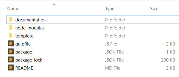
npm installIt might take a couple of minutes depends on your Internet connection. After successful completion of npm install command, you will be able to see node_modules folder that Gulp created (Please refer attached scrrenshot for final folders your project will contain). Everything is now installed and ready to go!

4. Running Gulp
Now you're ready to start building new pages. All you have to do is run "gulp" in Terminal. This will track all the sass file changes and start a local webserver.
gulp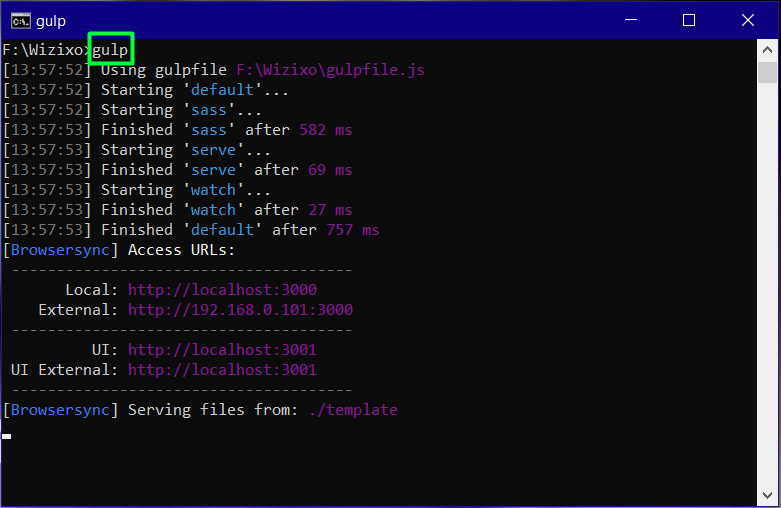
Customization
Learn how to create your own style without changing the theme's core files so that you can take advantage of future updates.
SCSS Method - user.scss (highly recommended)
We highly recommended to make edits and additions to the template CSS is to use the provided user-variables.scss and user.scss files located in the template/assets/scss folder.
- user-variables.scss will contain each variable you want to edit. Simply copy the variables you need to edit from the main _variables.scss and paste it in this file. It will automatically override the default values with the new ones.
- _user.scss will contain styles you want to add or edit.
Compiling changes
In order to see the changes, running Gulp command is required. To learn more about Gulp go the gulp section.
Note:When you update Wizixo, make sure you have backup of your files and not to override the user’s custom file, that may contain styles you have created already.
CSS Method - custom.scss
If you prefer to work with wizixo as a static source without Gulp and Sass, you will need to add custom CSS through a separate CSS file.
You just need to link custom.css at the end of <head> tag of each page. See example below:
<link rel="stylesheet" type="text/css" href="assets/css/custom.css" />
Page Loading (pre-loader)
You can change page pre-loader by changing below img path to your new pre-loader image path.
<div class="preloader">
  <img src="images/preloader.svg" alt="Pre-loader">
</div>
How to change Preloader color?
You can change the preloader color very easily. To do so, Just open preloader.svg file in your preferable text editor and change HEX color code with your value. You will also find Instructions in comment section of SVG file when you open this in text editor.
Note: Page Pre-loader are enabled by default. If you wish to disable the page pre-loader you can simply delete above code from all HTML files.
Logo Settings
Logo can be changed from below code inside the header container.
<a class="navbar-brand" href="index.html">
  <img src="assets/images/logo.svg" alt="Logo">
</a>
Logo height:
By default logo height is 44px. To change logo height, You should change value in $navbar-brand-height in _variables.scss file as per your need. Please note that if you increase logo height, your header height will increase automatically. You don't need to change your header height manually.
Fonts
By default, Wizixo uses the Google fonts. In case, If you want to change font to any other Google fonts, Please have a look in the head part of the webpage and you will find this tag:
<!-- Google Font -->
<link href="https://fonts.googleapis.com/css?family=Poppins:300,400,500,600,700,800,900%7CPlayfair+Display:400,400i,700,700i%7CRoboto:400,400i,500,700" rel="stylesheet">
To change the font, first go to Google fonts, choose your desired font and use the generated code.
If you have a need to use custom fonts, Remove above section completely and visit Self Hosted Fonts
Header Types
Wizixo comes with many predefined header styles. Simply adding the Header type class name to the Header tag will activate the Header Type. The list of Header type classes and it's descriptions are provided below for the reference:
| Header Class name | Description | Example code |
|---|---|---|
| .navbar-light | Header with white background & dark text. |
|
| .navbar-dark | Header with dark background & white text. |
|
| .navbar-primary | Header with primary background & white text. |
|
| .header-transparent | Header with transparent background. You can use the .header-dark, .header-light or .header-primary class depending on your site background. |
|
| .navbar-sticky | Header will stick to the top when scrolling. |
|
Theme color scheme
How to change theme default color scheme
We understand your need of changing theme color scheme at ease so We've got you covered. Whether you want to work with SCSS or CSS, both methods are described below. Please note we highly recommend to go with SCSS method.
#1 Using SCSS
After Completing gulp and sass setup, Copy below code and paste it in _user-variables.scss file located at template/assets/scss and then compile using gulp sass. If you are new to gulp, Please go through Gulp section here. Follow the steps and you will be able to build your site at very ease.
      // User Variables
      $primary:  #f5b150;
      $theme-colors: ();
      $theme-colors: map-merge(
       (
       "primary": $primary,
       "secondary": $secondary,
       "success": $success,
       "info":  $info,
       "warning": $warning,
       "danger":  $danger,
       "light":  $light,
       "dark":  $dark
       ),
       $theme-colors
      );

      //Theme gradient Colors - Starting and ending point
      $grad-start:  #f07a23;
      $grad-end:  #f5b150;

      $link-color: $primary;
      $link-hover-color:   darken($link-color, 10%);
      $navbar-light-hover-color:   $primary;
      $navbar-light-active-color:   $primary;
      $dropdown-link-hover-color:   $primary !important;
      $dropdown-link-active-color:  $primary;
By using this method, You have to change color codes only at three places and all your website color shades will be set properly.
Gulp must be running in your system to compile this. So when gulp is running, and you put above code into _user-variables.scss file and after saving the file, Gulp will compile the same and You will be automatically redirected to your default browser with site opened and changed orange color scheme.
#2 Using CSS
If you want to change theme default color scheme just using CSS, You can choose one of the 2 methods (We recommend Method 2 – Using color.css)
Method 1: Using style.css
If you don’t want to take advantage of future updates of theme, You can change theme color by replacing your new HEX color code in style.css located in template/assets/css directory. Please note this is not recommended option.
Method 2: Using color.css
Please look out for color.css file in template/assets/css directory for blue color as an example. You should link that CSS at the end in head section after theme CSS like below code:
      <!-- Theme CSS -->
      <link rel="stylesheet" type="text/css" href="assets/css/style.css" />

      <!-- Theme Color CSS -->
      <link rel="stylesheet" type="text/css" href="assets/css/color.css" />
Provided color.css within theme is for blue color scheme as an example. Please replace your color codes in the same and check the output.
Sliders
Tiny slider
Slider for all purposes, it lets you create a beautiful responsive slider. See Tiny slider example code below:
  <div class="tiny-slider">
    <div class="tiny-slider-inner">
      <!-- Slider items -->
      <div class="item"> <img src="assets/images/about/01.jpg" alt=""> </div>
      <div class="item"> <img src="assets/images/about/02.jpg" alt=""> </div>
      <div class="item"> <img src="assets/images/about/03.jpg" alt=""> </div>
    </div>
  </div>
We have provided Tiny Slider data attributes so you don't need to play with JavaScrips or CSS. The list of Tiny Slider data attributes type name and it's descriptions are provided below for the reference:
| Data Attributes name | Description | Available options |
|---|---|---|
| data-arrow="true" | Enable or disable arrow | Boolean (true or false) |
| data-dots="false" | Enable or disable dots | Boolean (true or false) |
| data-mode="false" | With carousel everything slides to the side, while gallery uses fade animations and changes all slides at once. | "carousel" | "gallery"/td> |
| data-axis="false" | The axis of the slider. | "horizontal" | "vertical" |
| data-items="1" | Slider items in all device. | Numbers (1 2 3 4 5 6 ....) |
| data-items-xs="2" | Slider items in extra small device. start to 575px | Numbers (1 2 3 4 5 6 ....) |
| data-items-sm="3" | Slider items in small device. 576px to 767px | Numbers (1 2 3 4 5 6 ....) |
| data-items-md="4" | Slider items in medium device. 768px to 991px | Numbers (1 2 3 4 5 6 ....) |
| data-items-lg="5" | Slider items in large device. 992px to 1199px | Numbers (1 2 3 4 5 6 ....) |
| data-items-xl="6" | Slider items in extra large device. 1200 to end | Numbers (1 2 3 4 5 6 ....) |
| data-autoplay="true" | Slider auto play enable or disable | Boolean (true or false) |
| data-autoplaytime="2000" | Slider next slide time in MS | Number MS |
| data-speed="1000" | Slider next slide speed (AKA: smartSpeed) in MS | Number MS |
| data-gutter="30" | Margin between 2 slider items in pixel | Number in px |
| data-edge="30" | Space on the outside (in "px"). | Number in px |
| data-loop="true" | Slider loop enable or disable | Boolean (true or false) |
| data-autowidth="true" | If true, the width of each slide will be its natural width as a inline-block box. | Boolean (true or false) |
| data-autoheight="true" | Height of slider container changes according to each slide's height. | Boolean (true or false) |
| data-hoverpause="true" | Slider pause on mouse hover. | Boolean (true or false) |
| data-touch="true" | Activates input detection for touch devices. | Boolean (true or false) |
| data-drag="true" | Changing slides by dragging them. | Boolean (true or false) |
| data-rewind="true" | Moves to the opposite edge when reaching the first or last slide. | Boolean (true or false) |
See example of how to use Tiny Slider data attributes:
  <div class="tiny-slider">
    <div class="tiny-slider-inner" data-arrow="true" data-dots="false" data-items-xl="6" data-items-lg="5" data-items-md="4" data-items-sm="3" data-items-xs="2" >
      <!-- Slider items -->
      <div class="item"> <img src="assets/images/about/01.jpg" alt=""> </div>
      <div class="item"> <img src="assets/images/about/02.jpg" alt=""> </div>
      <div class="item"> <img src="assets/images/about/03.jpg" alt=""> </div>
    </div>
  </div>
We have provided many arrow and dots styles kindly Checkout Elements Tiny Slider page
Page Elements
Page Titles
Use below code to display page title.
<div class="title text-center">
  <span class="pre-title">Pre title</span>
  <h2>Title</h2>
  <p>Description</p>
</div>
Note:Use .text-right and .text-center to display title in right align and center align.
Section padding
Use below helper class to maintain whole website section padding:
| Tag name or Class | Description |
|---|---|
| <section> | padding top 5rem and padding bottom 3.8rem |
| .section-pt | padding top 5rem |
| .section-pb | padding bottom 3.8rem |
Sticky sidebar (sticky element)
You can easily transform your existing Sidebar Content into Sticky Content by adding .sticky-element class:
<!-- Sidebar -->
<div class="container" data-sticky-container>
  <div class="row">
    <div class="col-md-4 sidebar">
      <div data-sticky data-margin-top="80" data-sticky-for="767">
        <h2 class="mt-3 mt-md-0 mb-3">Job details</h2>
        <ul class="list-unstyled p-0">
          <li class="mb-3"><strong>Posted:</strong> 3 July 2018 </li>
          <li class="mb-3"><strong>Location:</strong> London </li>
          <li class="mb-3"><strong>Specialism:</strong> IT </li>
          <li class="mb-3"><strong>Job type:</strong> Permanent </li>
          <li class="mb-3"><strong>Reference number:</strong> CRR0001-18 </li>
          <li class="mb-3"><strong>Contact:</strong> Jessica Mores</li>
          <li class="mb-3"><strong>Phone:</strong> (+251) 854-6308 </li>
        </ul>
        <a class="d-block mt-3" href="#"><i class="fa fa-print me-2"></i> Print</a>
      </div>
    </div>
  </div>
</div>
<!-- Sidebar end-->
Note: Sticky Sidebar currently works best with the Sidebar and Bootstrap Columns. use .sticky-element class inside bootstrap columns as above example.
Sticky sidebar offset top can be set from functions.js file.
Back to top
Use below code to display back to top. Back to top is enabled by default if you want to remove back to top then simple remove below code from all HTML files:
<div> <a href="#" class="back-top btn btn-grad"><i class="ti-angle-up"></i></a> </div>
Buttons
You can place button just about anywhere using the CSS Prefix .btn and the button name. The list of button type classes and it's descriptions are provided below for the reference:
| Class name | Description | Example code |
|---|---|---|
| .btn-primary | Primary color button | |
| .btn-grad | Gradient color button | |
| .btn-dark | Dark color button | |
| .btn-light | Light color button | |
| .btn-white | White color button | |
| .btn-secondary | Secondary (dark gray) color button | |
| .btn-success | Success (green) color button | |
| .btn-danger | Danger (red) color button | |
| .btn-warning | Warning (yellow) color button | |
| .btn-info | Info (cyan) color button | |
| .btn-link | Simple link button | |
| .btn-outline-primary | Button with borders. To add button with border, You just need to use outline after btn prefix and then simply button type. For example, .btn-outline-dark This will create button with dark border. | |
| .btn-round | Rounded Button | |
| Button with icon. You can use any font icon before button name. | |
|
| .btn-xs | Use this class for mini button | |
| .btn-sm | Use this class for small button | |
| .btn-lg | Use this class for large button | |
Font icons
We have included font awesome and Themify Icons fonts in Wizixo theme. A complete list of icons along with the class names can be found here: Font awesome and Themify Icons
Font awesome:
You can place Font Awesome icons just about anywhere using the CSS Prefix fa and the icon's name. See below example code:
<i class="fas fa-camera"></i>
Themify Icons:
You can place Themify Icons icons just about anywhere using icon's name. See below example code:
<i class="ti-arrow-up"></i>
Google map
we use google map with an iframe in wizixo
Google map with iFrame:
Follow below steps to create Google map iFrame.
- Go to Google Maps
- Type in your address in search bar and select your location from searched results or click on your location pin on the map
- If you need to choose a satellite view, then select a satellite view box before going to the next step. And for street view, drag a little yellow human icon onto map.
- Click on the Hamburger menu icon and click on Share or embed map
- In popup, select Embed a map and copy HTML iFrame code
- Past it in your HTML
See example code below:
<iframe class="w-100" height="500" src="https://www.google.com/maps/embed?pb=!1m18!1m12!1m3!1d3022.9663095343008!2d-74.00425878428698!3d40.74076684379132!2m3!1f0!2f0!3f0!3m2!1i1024!2i768!4f13.1!3m3!1m2!1s0x89c259bf5c1654f3%3A0xc80f9cfce5383d5d!2sGoogle!5e0!3m2!1sen!2sin!4v1586000412513!5m2!1sen!2sin" style="border:0;" aria-hidden="false" tabindex="0"></iframe>
Animations (AOS - Animate on scroll library)
You can add animations to any elements in your website. Animations can be shown on scroll appear. See code example below:
  <div class="aos" data-aos="fade-up" data-aos-delay="200" data-aos-duration="1000" data-aos-easing="ease-in-out">
  ...
  </div>
The animation can be set to:
| Fade animations | Flip animations | Slide animations | Zoom animations |
|---|---|---|---|
| fade | flip-up | slide-up | zoom-in |
| fade-up | flip-down | slide-down | zoom-in-up |
| fade-down | flip-left | slide-left | zoom-in-down |
| fade-left | flip-right | slide-right | zoom-in-left |
| fade-right | zoom-in-right | ||
| fade-up-right | zoom-out | ||
| fade-up-left | zoom-out-up | ||
| fade-down-right | zoom-out-down | ||
| fade-down-left | zoom-out-left | ||
| fade-down-left | zoom-out-right |
You can choose one of these timing function to animate elements nicely:
| linear | ease | ease-in | ease-out | ease-in-out |
| ease-in-back | ease-out-back | ease-in-out-back | ease-in-sine | ease-out-sine |
| ease-in-out-sine | ease-in-quad | ease-out-quad | ease-in-out-quad | ease-in-cubic |
| ease-out-cubic | ease-in-out-cubic | ease-in-quart | ease-out-quart | ease-in-out-quart |
Advanced Options:
- data-aos: Change the animation type
- data-aos-duration: Change the animation duration in MS
- data-aos-delay: Delay before the animation starts in MS
- data-aos-offset: Distance to start the animation in pixel (related to the browser bottom)
- data-aos-easing: This timing functions are use to animate elements
For more info please Visit aos.js docs
helper classes
Lorem ipsum dolor sit amet, consectetur adipisicing elit. Eum cumque nisi sit. Ipsam magni quaerat labore eaque dolorum vitae ipsa beatae, molestias sint iure reiciendis aliquid porro vel, recusandae temporibus.
Text Colors
You can add this helper class to any element in your HTML code to set text color:
| Class name | Description |
|---|---|
| .text-primary | Main primary color text |
| .text-white | White color text |
| .all-text-white | All White color text |
| .text-dark | Dark color text |
| .text-grad | Gradient color text |
You can also use bootstrap color classes.
Extra helper classes
We have created some really useful helper classes for you. Here are a few of them:
- .zoom-on-hover Zoom on hover
- .up-on-hover Slide Up on hover
- .primary-hover Primary color on a tag of this class
- .title-font font family primary (Poppins)
- .body-font font family secondary (Roboto)
- .alt-font font family tertiary (Playfair Display)
Contact Form
To make contact form work, simply go to template/include/contact-action.php file. Look out for $recip_address = "info@yourdomain.com"; on line number 11 and replace your email there. If you want to add multiple email recipients, Please follow the instructions written at line number 13 in contact-action.php file.
Our Tips
Check out some of our tips and tricks that will speed up your website and work process.
General tips
- We recommend Sublime Text software that is light-weight and super easy to use.
- We recommend FileZilla FTP manager.
- When you finish with your site make sure you check below points:
- Make sure you don't have any console error in your console log
- Validate your code with W3C Markup Validation Service
FAQs
Why there are no images that were in live demo?
All images are only for demonstration purpose, however you can re-download them from sites we have listed in Credits section.
Why some videos might not work?
Ajax methods of Jquery are used for some videos and they can work only on the real server. For the correct operation of all functions, upload your website on a real server.
Why contact form doesn’t work?
For the correct operation of contact form, the php support is necessary. Upload your website on a server with support of PHP and PHP mail() function.
Source & Credits
All images are only for demonstration purpose, however you can re-download them in sites below.
Images
JavaScrips
CSS and Fonts
PHP
Changelog
v2.0.0 - 1st Oct 2021
Wizixo v2.0 is a major rewrite of the entire template with Bootstrap 5. Migration from v1.x to v2.x is not possible.
- New
- Rebuilt Wizixo core to fully support Bootstrap to v5.1.0
- Dropped jQuery entirely. Replace all jQuery dependent plugins to Vanilla JavaScript plugins
- Updated
- Packages and dependencies to the latest. Switched from deprecated node-sass to dart-sass
- Offcanvas component
- Other small changes.
- Dropped
- jQuery dependency
- No longer supports IE
v1.2.0 - 15th Feb 2021
- Update
- Bootstrap v4.6.0
- jQuery to v3.5.1
- Fixed
- Breadcrumb issue after updating to Bootstrap v4.6.0 /template/assets/scss/core/general.scss
- Dropped
- Node.js < 10 for development. Update your node.js to latest LTS version. You might need to run Run `npm rebuild node-sass` to download the binding for your current environment.
v1.1.0 - 4th Jan 2020
- Update
- Bootstrap 4.4.1
v1.0.1 - 16 Sep 2019
- Documentation updates
- Added: theme color scheme changing guide
- Added: logo image changing guide
- Updated: contact form using guide
- Fixed: contact form issue (sending e-mail 2 times)
- Updated template/contact.html
- Updated template/assets/include/contact-action.php
- Fixed: owl carousel data-autoplay attribute
- Updated template/assets/js/functions.js
v1.0.0 - 26 Mar 2019
- Initial Release
Support
We've tried to make this documentation as easy and understandable as possible. However, in case of any difficulties with the theme, you can contact our technical support department with any suggestions regarding documentation and theme improvement.
- Generate ticket through our Support portal
Included in Support:
- Fixing all issues related to original theme.
- Answers to questions regarding theme.
- Providing regular updates depending on your needs and feedbacks.
Not Included in Support:
- Customization of theme.
- Specific support for third party plugins integrated in theme.
Your read it entirely. Thanks!